
A managing partner at a five-attorney family firm forwards you three redesign proposals. Each opens with a hero video, a new palette, and the phrase "modern, mobile-first experience." None of them lists which pages will change, who answers the phone after launch, or how anyone will know in six months whether the project worked.
The doubt driving those proposals is real. In 2024, 44.3% of respondents said an old or outdated law-firm website would raise doubts about the firm's quality and technological capability, according to iLawyer Marketing's annual survey as reported by the Law Society of New South Wales Journal. A new look doesn't settle that on its own.
A lawyer website redesign earns its budget when it functions as an intake system: pages that answer one legal problem, forms that route a matter without over-collecting, claims that survive an ethics review, and speed and accessibility measured on real phones. The failure order is predictable. Visual decisions get made first, intake and technical decisions get made last, and the site launches attractive and leaky.
Table of Contents
- Set Redesign Goals You Can Measure
- How to Audit Your Current Site Before Redesigning
- Structure Practice-Area Pages for Search and AI Answers
- Speed, Mobile and Accessibility Standards Built Into the Build
- Move URLs Without Losing Rankings
- Design Intake Forms That Protect Confidentiality and Convert
- Keep Every Headline and Claim Compliant
- Judge the Numbers and Choose Your Redesign Scope
Set Redesign Goals You Can Measure
Goals fail two ways in a redesign. They name a feeling ("look more modern," "feel more established") or they name a number nobody measured before kickoff, so six months after launch nobody can say whether the project paid for itself. Fix that before the first wireframe.
Prospective clients do not arrive through one door. A 2019 Legal Trends consumer study surveyed 2,000 U.S. adults on how people search for professional legal services, covering lawyer websites, search engines, online reviews, directories, and referrals, and it found that referrals were not the only route to legal help and that consumers set a high threshold before deciding whom to contact and hire (Clio's Legal Trends Report).
That spread of channels works as a design brief. Search lands on a practice-area page, so each page has to answer one legal problem on its own. The firm site confirms the attorney is real and the office is close. Reviews break the tie. A referred prospect arrives half-convinced and still checks the site before dialing. Every path ends on a page that either routes the matter toward a consultation or loses it, which is why the goal list starts with the intake path, then the homepage.
The metrics that separate a redesign from a reskin
Write the goals first, then name the number that proves each one, then record where that number stands today. Without the third column, nobody can tell whether the project helped.
| Goal | Metric to track | Baseline to record |
|---|---|---|
| Earn more qualified inquiries | Consultation requests matched to a practice area and location | Monthly requests split by practice area for the last 12 months |
| Convert mobile visitors | Form starts, form completions and click-to-call taps on phones | Mobile share of sessions and conversion rate by page |
| Improve page speed | Largest Contentful Paint and Interaction to Next Paint from real-user data | Field data for the top 10 landing pages |
| Meet accessibility standards | Pages and intake paths passing keyboard and screen-reader tests | Count of open defects by severity |
| Build visible trust | Attorney and contact page engagement, calls and consultation bookings | Calls and bookings per attorney page |
| Limit sensitive data exposure | Fields collected before a matter is routed | Number of fields on each current intake form |
"Qualified" needs a working definition before anyone counts a baseline: a request that names a practice area and location the firm serves, for a matter type it takes. Raw form submissions mislead more firms than any other metric. A short form with a weak confirmation step can triple inquiries while signed matters stay flat, because the extra volume was never qualified in the first place. Track three stages separately: requests matching the definition, consultations that take place, and matters that open.
Do this before anyone opens a design file: write three goals, assign one named owner to each, and record every baseline in the third column.
How to Audit Your Current Site Before Redesigning
A redesign that skips the audit throws away pages currently earning search visits, calls and signed matters. New typography doesn't replace them. Start with what you already own, and work through seven steps in order, because each step feeds the next.
Export every indexed URL. Pull the sitemap and cross-check it against a crawl of the live site, then group pages into practice area, attorney, location, contact and legal notices. You can't decide what to keep until the whole inventory is visible, and a walkthrough of auditing your site for organic growth covers the crawl and export mechanics.
Pull 12 months of analytics. List the landing pages that earn organic visits, the share of sessions on phones, and the conversions each page produces. A page with steady search traffic and zero inquiries has a broken next step. That's a fix candidate, not a delete candidate.
Test your top pages on a phone at common widths. Text must be readable without zooming, buttons easy to tap, navigation usable one-handed. Mobile usability became a formal search visibility issue when Google began rolling out its mobile-friendly ranking update on April 21, 2015, applied worldwide to searches on mobile phones and described as page-level, so a single page could benefit even when other pages on the same site were not mobile-friendly (Google's announcement).
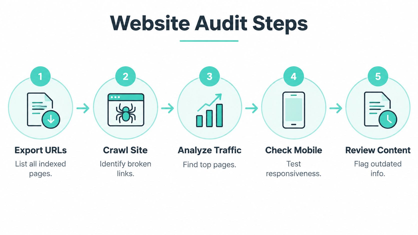
Check field Core Web Vitals on the templates carrying the most traffic. Lab scores flatter you. Real-user data from the pages that receive ad and search clicks tells you whether a visitor on a mid-range Android phone waits for the headline.
Complete the key tasks with a keyboard, then with a screen reader. Find a practice area, tap to call, submit a form. If the tab order disappears into a chat widget or the form errors aren't announced, the path fails for a real share of visitors, and on an intake form that failure also means a lost consultation.
Flag outdated content. Old attorney bios, dead links, wrong office hours, undated guides, a fee page from three years ago. Each one costs credibility with a prospect who is comparing two firms that look otherwise identical.
Read every headline and testimonial as a regulator would. Mark the claims that need support, the results quoted without context, and the comparisons you can't document. Anything flagged here goes on the compliance list for the rewrite, because rewriting copy around an unsupported claim is cheaper than defending it later.
Each page now gets one of three labels: keep, fix, or remove. That list is the redesign scope, and it feeds directly into a law firm SEO audit checklist that keeps the technical layer from becoming an afterthought once design starts.
Structure Practice-Area Pages for Search and AI Answers
Divorce isn't one search. Someone drafting a parenting plan, someone served with papers last night, and someone comparing mediators type different things, land on different pages, and need different next steps. Folding all three into a single family law page serves none of them.
One hub, then one page per matter
Build a hub for each practice area and a focused page for every matter clients search for, such as divorce, child custody, support modification, or a prenuptial agreement. Keep them under stable, readable URLs grouped by practice area. Each page opens with a direct two or three sentence answer to the query, then covers the process, typical timelines, what drives cost, and the next step in plain language.
Navigation should read like a client's sentence. "I need help with child custody" and "I need an estate plan" outperform department names every time, because the visitor is describing a problem, not a firm's org chart.

Technical basics that carry the structure
- One H1 that matches the main query. A single heading per page, with a logical hierarchy beneath it that reflects the content rather than the visual layout.
- Descriptive title tags. Unique on every page, written for the query, not for the firm's internal naming.
- Internal links in both directions. Practice pages link to the attorney bios and location pages that support them, and bios link back to the practices those attorneys really handle.
- Visible update dates and cited sources. A legal explanation without a date or a reference is harder to trust and harder to quote.
Write for answer engines without writing for robots
Place a short, accurate summary near the top of each practice page so an AI answer tool has something clean to quote, then use an FAQ block for the questions clients ask before they know which attorney to call. Structured data belongs in the build only where it matches visible content. Thin doorway pages built around a city keyword still fail, and they fail faster now that answers get assembled from the pages that show real substance. The generative engine optimization work for law firms that moves citation rates starts with this page structure, not with markup.
Page rule: one primary query, one primary action, one named attorney per practice page.
Speed, Mobile and Accessibility Standards Built Into the Build
A prospective client taps your firm's site from a search result, waits four seconds for the page to render, and calls the next firm on the list. Speed, mobile layout and accessibility decide whether a visit becomes a consultation request, so each one needs a named threshold and a test that proves it before launch, not a checkbox on launch day.
Performance measured on real users
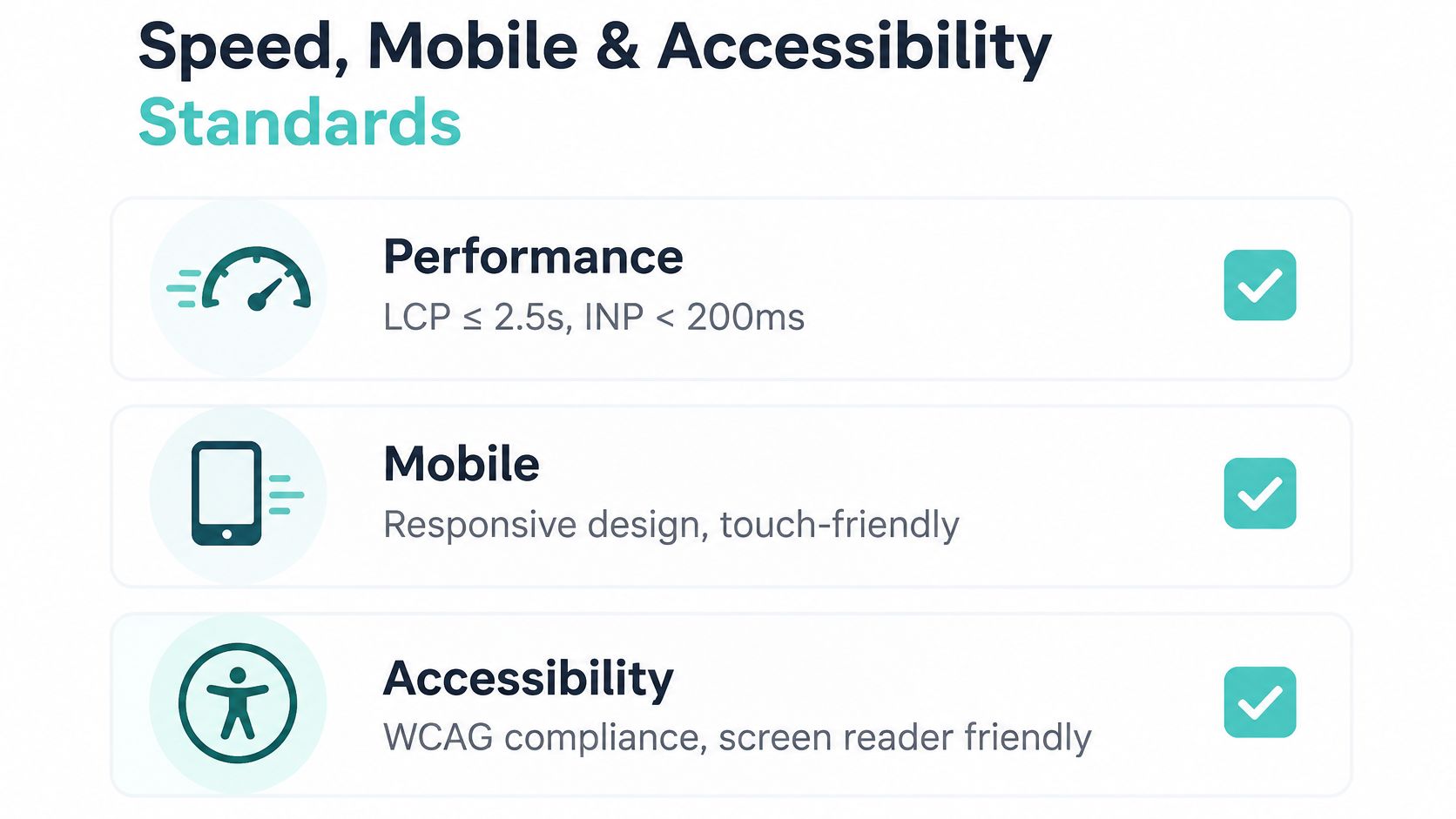
Google's Core Web Vitals set the field thresholds that matter here: a Largest Contentful Paint of 2.5 seconds or less and an Interaction to Next Paint of under 200 milliseconds, both measured on real users rather than estimated in a lab.
Law firm sites fail these for the same four reasons: an oversized hero video, uncompressed attorney photography, a chat widget that loads before the headline, and more third-party scripts than anyone can name. The fix list is unglamorous and effective. Serve responsive next-generation images, preload only the true above-the-fold visual, reserve fixed dimensions for images and embeds, defer nonessential scripts, cut font variants, and watch field data instead of a lab score. A page that scores well in a synthetic test can still stall on the mid-range phone your actual client carries.
Mobile checked template by template
The homepage is not the site. Test each practice template, the attorney profile, the contact page, and the intake form on common phone sizes, in one column, with tap targets a thumb can hit. Most legal traffic that converts arrives on a phone, and a template that only works on a desktop is a template that loses cases. The intake form deserves the hardest look, because that is where a motivated visitor either submits confidential details or gives up on a field that will not focus.
Accessibility as risk control, not a badge
The Web Content Accessibility Guidelines 2.2 organize accessibility into four principles: perceivable, operable, understandable and compatible, with testable criteria at Levels A, AA and AAA. For a law firm, the workable target is Level AA: text alternatives for headshots, icons, video and scanned documents, keyboard access to every intake function, visible focus, labels and error messages tied to their fields, descriptive link names, and accessible PDFs.
Automated scans find part of that and miss the rest. Test with the keyboard alone, at 200% zoom, with a screen reader, and through every third-party component, because chat windows, cookie banners, CAPTCHA and scheduling tools are where focus most often gets trapped. If the firm has already received a demand letter, the practical steps in this guide to how to avoid ADA demand letters are worth reading before the next release.
| Standard | Threshold | Test |
|---|---|---|
| Largest Contentful Paint | 2.5 seconds or less on real-user data | Field data on the top 10 templates |
| Interaction to Next Paint | Under 200 milliseconds on real-user data | Field data on the top 10 templates |
| Mobile layout | Legible text, sized tap targets and one column on common phone sizes | Manual check on every practice template |
| Text alternatives | Alt text for headshots, icons, videos and scanned documents | Screen-reader pass on each page |
| Keyboard access | Every intake and contact function works by keyboard with visible focus | Keyboard-only run through each intake path |
| Form errors | Labels and error messages tied to fields | Screen-reader and error-submission test |
| Third-party widgets | Chat, cookie banners, CAPTCHA and scheduling tools do not trap focus | Keyboard and screen-reader test on each widget |
| Accessibility target | WCAG 2.2 Level AA | Automated scan plus manual testing, defects logged by severity |
No practice template goes live until it clears all three standards, and defects get logged by severity and retested after deployment. A website maintenance checklist for law firms keeps that discipline going once the launch traffic settles.
Move URLs Without Losing Rankings
Most redesign traffic losses happen on launch day, not in the design. Search equity lives partly in specific URLs, and a new site structure that swaps them without a map turns every directory listing and inbound link into a dead end.
Work the launch in this order.
- Map every indexed URL from the audit export to either a kept page or a named replacement. A URL with no destination is a decision someone forgot to make.
- Keep practice-area URLs stable wherever they rank. If one must change, it changes through the redirect map, not through a developer's preference for tidier paths.
- Redirect removed pages with a 301 to the closest live equivalent. Never to the homepage. A homepage redirect tells the visitor nothing and tells the search engine the topic disappeared.
- Protect the top 10 landing pages from the 12-month analytics. Keep their titles, H1s and internal links, then diff them after launch.
- Update the Google Business Profile and every directory listing to the new URLs and the new phone route, because a stale listing sends calls nowhere.
- Build on staging behind noindex, then check for redirect chains, 404s and a correct sitemap before launch. Staging environments love to ship their own noindex tags by accident.
- Watch impressions, clicks and landing-page conversions for 90 days against the baselines from your goals table, and fix any drop within weeks instead of waiting for a quarterly review.
If the project also changes domains, treat it as its own mini-project with its own checklist. Reading up on how to avoid common domain migration mistakes before you file a change of address is cheaper than diagnosing a traffic cliff afterward.
Design Intake Forms That Protect Confidentiality and Convert
The most common intake mistake is asking for the story too early. A contact form is not a consultation, and it isn't a secure channel just because it sits behind a padlock.
Ordinary web forms create real exposure. As Refact's law firm website design guide points out, a contact form can send unencrypted case facts to a shared inbox, and privacy notices should explain the data flows involving chat widgets and AI tools. Map every collection point, including forms, chat, call tracking, scheduling tools and newsletter sign-ups, and write down which vendors receive the data.
| Field | Collect at first contact | Reason |
|---|---|---|
| Name | Yes | Routes the inquiry and enables follow-up |
| Phone or email | Yes | Gives the firm a contact route |
| Practice area (dropdown) | Yes | Routes the inquiry to the right team |
| State or county | Yes | Confirms the firm handles the matter |
| Short case summary | One sentence or defer | Limits detailed narratives sent through unsecured channels |
| Deadline or urgency date | Optional | Triages time-sensitive matters |
| Document upload | No, use a secure portal | Keeps sensitive files out of ordinary email |
| Marketing consent checkbox | Separate from the intake form | Keeps newsletter consent apart from a request for legal help |
Shorter isn't automatically better
Cutting fields raises volume and can lower the share of qualified matters, while a long narrative box invites a client to disclose more than they should before conflicts are checked. The balance is a routed first contact: enough to identify the practice area, the location and how to reach the person, plus one sentence they choose to share. After submission, state plainly who responds, how quickly, and what happens next.
Measure qualified consultations, signed matters and downstream revenue rather than raw submissions. Benchmarks move with practice area, device, urgency, traffic source and what the firm counts as a conversion, so cross-firm comparisons mislead more often than they inform.
Practical rule: one secure intake route per practice area, written down and tested, before any paid traffic points at it.
Persistent phone and consultation buttons, a plain-language "what happens next" note and a privacy notice that names chat and AI tools do more for conversion than a clever headline. The consultation landing pages built for law firms take the same logic one step further by matching the page to a single campaign.
Keep Every Headline and Claim Compliant
Every word on the new site is a communication about the lawyer's services, and ABA Model Rule 7.1 puts three specific constraints on it. A statement is problematic if it contains a material misrepresentation of fact or law, or omits information needed to keep it from being materially misleading. It's also problematic if it creates an unjustified expectation about results, or compares the firm's services with another lawyer's without factual substantiation.
That covers headlines, testimonials, case results, comparison claims and calls to action, and it reaches advertising governed by Rule 7.2 as well.
| Claim on the page | Risk | Fix |
|---|---|---|
| Best lawyer in the city | Unsubstantiated comparison | Remove, or document with verifiable evidence where permitted |
| We win most of our cases | Implies a result expectation | Remove, or qualify with complete and dated data |
| Past verdict or settlement | Omits context and can mislead | Add jurisdiction, year, matter type and a note that outcomes vary |
| Client testimonial about a result | Implies the same outcome for others | Add context, a disclaimer and jurisdiction-specific review |
| Free consultation | Omits fee terms | State the conditions and what the consultation covers |
| Certified specialist | Requires accuracy | Name the certifying body and confirm the jurisdiction allows the claim |
A review routine that survives contact with a deadline
List every claim on every page in a spreadsheet, one row per sentence that asserts something. Record the evidence for it, add the qualifying context, and delete anything you can't document. For past results, name the jurisdiction, the year and the matter type, and note that outcomes depend on the facts. Apply the same care to testimonials and to any specialist or certification language, which some jurisdictions restrict.
On past results: a verdict without a year, a court and a matter description is a decoration, not a credential.
Compliance and credibility point the same direction. Stanford's Web Credibility Project finds that credibility increases when a site makes it easy to verify the accuracy of information through third-party support, citations, references or source material, and it identifies clear contact information, phone number, physical address and email address, as a direct credibility signal. Professional design appropriate to the site's purpose, visible update dates and cited authorities do double duty: they reassure the prospect and they support the claim.
An attorney or compliance reviewer signs off every page before publication. That sign-off is a launch gate, not a formality.
Judge the Numbers and Choose Your Redesign Scope
Case studies are useful and incomplete. Read them with the limits in view before you plan a budget around one.
SimpleLab Digital reports that Marcus Law Offices grew from $20K per month to $150K per month within one year using the Booster package, which pairs ads, social content, a landing page and four-week email and SMS follow-up rather than a full site rebuild. Those are firm-wide revenue figures supplied by SimpleLab Digital, they are not attributed to the service alone, and individual outcomes vary. Ask what changed, what stayed the same, and over what period before you treat any number as a forecast.

A worked example at small-firm scale
Take an illustrative small family-law firm: a homepage last touched years ago, a phone number buried in a footer, and a five-field contact form that lands in a shared inbox.
Run the work in order. Audit the pages and label them keep, fix or remove. Build one hub and three matter pages. Fix the hero image, defer the chat script and reserve dimensions. Cut the narrative box to one sentence, add a practice-area dropdown and route submissions to a secure destination. Review four headlines that promise outcomes and rewrite them with context.
At 90 days, compare qualified consultations, mobile conversion rate and page speed by template against the baselines recorded before work started. That comparison is what tells you whether the scope was right, which is what the law firm marketing ROI measurement guide is built to support.
The scope decision comes down to three rules
- Refresh when pages are mostly accurate but slow or awkward on a phone. Speed, mobile layout and intake fixes often recover more than a rebuild would.
- Rebuild templates when the same intake, mobile and accessibility defects recur across many pages. At that point you're paying to patch a structure, not a page.
- Run a full redesign when practice focus, branding and navigation are all out of date together. Anything narrower leaves the core problem in place.
The walkthrough below is a useful companion to those rules.
Four questions to settle before you sign anything
Ask which pages are included, who owns the content and the code, how qualified inquiries get measured, and what happens on cancellation. Get the answers in writing and attach them to the scope. Scope and ownership get documented before checkout and the work runs on monthly terms, so a firm isn't locked into a long contract to keep its own website.
A redesign can't fix unclear practice focus, an unresponsive phone line or a fee structure clients don't understand. It can make the firm easy to find, easy to evaluate and easy to contact. Complete the audit this week, then request a scope that lists every page, every owner and every launch check.
SimpleLab Digital builds the whole chain a redesign depends on: practice-area pages, campaign landing pages, intake routes and the follow-up that keeps inquiries warm after the first contact. If your site is losing qualified consultations between the search result and the phone call, the SEO/GEO and website maintenance service starts with an audit and then moves to ongoing optimization, so the fixes happen in a measured order. Visit SimpleLab Digital to see the packages and the ROMI calculator, then start with the audit.