Pretty screenshots earn saves and shares, but that alone does not make them the best examples of landing pages. A page can look polished while leaving the offer unclear, asking too much on its form, or promising something different from the ad that brought the visitor there.
Useful examples make three conversion mechanics easy to inspect: whether the offer is clear, whether the next step creates unnecessary friction, and whether follow-up fits the visitor's source. A page built for a search ad may need a different path from one reached through social media or a referral. Visual design matters, but it cannot fix a weak offer or a mismatched next step.
The seven resources below serve small firms and local services looking for lessons they can apply, rather than designs to admire. The list favors pages whose offer, next step, and follow-up are easy to audit, without assigning a formal score. It includes SimpleLab Digital's landing page service alongside public libraries and design archives. To see a product's terms in plain language, read the Carti user agreement.
Table of Contents
- 1. SimpleLab Digital – Landing Page Creation
- 2. Unbounce
- 3. Instapage
- 4. HubSpot
- 5. Shopify
- 6. Lapa Ninja
- 7. Webflow Made in Webflow
- Landing page examples and resources compared
- Turn These Landing Page Lessons Into Leads
1. SimpleLab Digital – Landing Page Creation
A landing page earns its place by making one offer and one next step clear. For a small business or law firm, that means matching the page to the campaign and service, rather than asking visitors to find their way through a general website. The conversion mechanics are practical: clear offer, focused action, and follow-up that continues the same conversation.
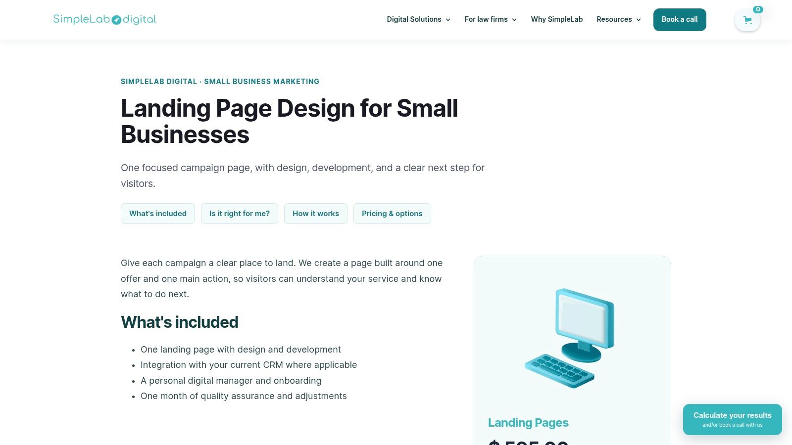
Landing Page Creation is available from SimpleLab Digital as a standalone service. The page includes copy, design, development, publishing, applicable CRM integration, and one month of quality assurance. It is built around a primary action, such as requesting a consultation or making another qualified inquiry. For advertising packages, the campaign, landing page, and included follow-up work together, with automations handling the agreed messages.
What you can actually copy
Page speed and focus affect the path to conversion. Google's mobile-page research found that, as load time increased from one second to ten seconds, the probability of a visitor bouncing rose by 123%. It also linked an increase from roughly 400 to 6,000 page elements with a 95% decline in conversion probability. Keep the page light: compress images, make the action easy to find, and remove sections that do not clarify the offer, provide proof, or explain what happens next.
- Defined offer: Focus the page on one service and one next step. A menu of practice areas gives visitors extra decisions before they act.
- Connected follow-up: Keep the ad's promise consistent on the page and in email or SMS. Follow-up gives an interested visitor a clear route to respond.
- Timing: A typical build window is 7 to 10 business days, depending on goals, access, and the files needed to complete the page.
- Commercial shape: The page can be purchased on its own or included in a month-to-month package. A one-time project follows its agreed scope; it is not covered by the monthly subscription cancellation policy.
Practical rule: If an ad offers a free consultation, repeat that promise in the headline and ask only for information needed to respond to the inquiry.
Comparing landing page builders with AI features can help with an initial sketch. The builder does not decide the conversion mechanics for you: choose the offer, limit the form fields to what is needed, and assign someone to reply. A page can look finished and still lose inquiries if those decisions are unclear.
2. Unbounce
Unbounce's example library is the swipe file I open when someone says "show me something in my industry." It walks through about 40 pages across ecommerce, SaaS, education, finance, travel, and local services. The notes talk about audience, proof, and the button, not only the palette.
A median is a sanity check, not a target. MarketingProfs' chart of Unbounce's 2024 benchmark, based on more than 41,000 pages, reported a 6.6% median landing-page conversion rate across industries. If your consultation page sits well under that, fix message match before you restyle the hero. If you're above it and the leads are unqualified, the rate is lying. Read what a conversion rate is and how to calculate it before you celebrate a percentage.
Use the library this way:
- Compare mechanics: Look for one offer, one action, and proof near the button.
- Borrow the criticism: Notes that say what could be tighter beat applause.
- Ignore the pitch: The resource also sells Unbounce's builder. The examples can still teach, but this isn't an independent lab.
Live pages drift after publication, and a broad set still makes you hunt for a family-law consult or a quote form. I wouldn't launch from an old screenshot without opening the current URL.
3. Instapage
Instapage's landing page examples review about 30 pages and, unlike a pure gallery, suggest tests. Headlines, proof, structure, and the button get a conversion read, then a variant worth trying. That's the right instinct. Results still depend on audience, offer, and traffic source, and the site also sells page software, so treat every tip as a hypothesis.
The question most roundups skip is which patterns survive a locally regulated service. CartFlows' landing-page statistics report that mobile generated 83% of visits, while desktop converted about 8% better overall, and legal pages were an exception, with mobile converting better in that category. Mobile-first is the direction. It isn't a law-firm strategy by itself. Test by practice area, device, urgency, and whether the inquiry became a consult. Our notes on landing pages for law firm consultations cover confidentiality, jurisdiction, and what the visitor should expect after submit.
A raw form fill isn't a win if nobody qualified for a consult.
Instapage is thin on local professional services. Use the test ideas, then rewrite the proof for your city and practice, not for a SaaS trial.
4. HubSpot
If someone on your team has never separated a landing page from a homepage, start in HubSpot's library. The landing page examples list is free to browse, and the write-ups usually cover layout, copy, forms, and calls to action in plain language. HubSpot also promotes its own platform and templates, and the brands skew large. A national logo bar won't calm a visitor who needs to know you handle immigration matters in their state.
When a longer page is the point
Depth is a choice, not a virtue. In a landing-page A/B test case study, traffic was split evenly, and a 4,000-word page with four videos beat a 1,500-word page with one video by 96% on waitlist sign-ups. I would copy that length only when the offer needs education, which is common in legal, financial, and clinical work. Put proof and the objection next to a repeated button, and judge completed forms plus lead quality, not time on page.
More of that build thinking sits in our high-conversion landing pages and websites category. A hot search click still wants a short path. Don't add thousands of words just to look thorough.
5. Shopify
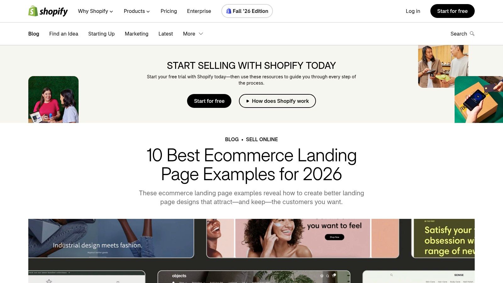
Shopify's guide is the ecommerce slice of this list. The ecommerce landing page examples show sales, lead capture, and product choice, with notes on imagery, proof, and the button. If you sell direct to consumer, message match is concrete. The ad's discount should be the headline, and the product should be buyable without a tour of the whole catalog.
Checkout friction is the quiet tax on those pages. Baymard's checkout usability research, drawn from 12 studies and 20,240 participants, found an average potential conversion increase of 35% when checkout usability improves. On a campaign page that means one primary action, fewer fields, clear labels, and no scavenger hunt across three URLs. The same logic shows up when you boost e-commerce sales with offers, proof, and traffic that all describe the same product.
Where this set stops helping:
- Professional services: A consult isn't an add-to-cart. Don't paste a product grid onto a family-law page.
- Page-type blur: Product pages and campaign pages overlap here. Name the campaign goal before you steal a layout.
- Platform gravity: The advice points back to Shopify. Useful if you're on it, irrelevant if you're not.
6. Lapa Ninja
Lapa Ninja is a design archive, not a conversion report. You can browse full-page captures from the opening section through the footer, filter by category, color, and typeface, and park references on boards. Free browsing is enough for a visual pass. It will not tell you whether the page made money.
Say you run ads for an electrician and fall for a dark, full-bleed hero. The archive cannot tell you the quote button was ignored. Contentsquare's A/B testing examples describe how Bannersnack read click heatmaps, then tested a larger, higher-contrast button, and sign-ups rose 25%. Diagnose clicks, ignored blocks, and mobile taps, then change one element against a stable control. Keep the audience, the source, the offer, and the conversion definition fixed. For local trades, study real electrician sites and quote forms the same way. Where is the quote, how many fields are required, and what happens after submit?
A gallery shows what a page looked like. It doesn't show who clicked, who qualified, or who paid.
Screenshots go stale. A board of attractive pages is a reference pile, not a winner's list.
7. Webflow Made in Webflow
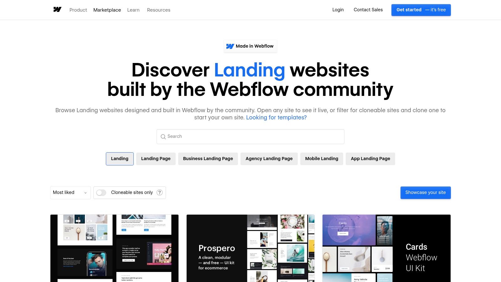
A polished landing page is not proof of a page that converts. Made in Webflow is a community showcase useful for studying layout, typography, imagery, and interaction. The quality varies, and the collection does not assess performance. Browse it for visual ideas, then judge each example against the offer, copy, and conversion goal you need.
The 2008 Obama campaign offers a more useful lesson about testing. Wired's account of the campaign's A/B testing describes tests of hero images and calls to action, including “Sign Up,” “Sign Up Now,” “Join Us Now,” and “Learn More.” “Learn More” generated 18.6% more sign-ups per visitor than the original “Sign Up” wording. A black-and-white family photo beat the default turquoise image by 13.1%. Together, the changes increased sign-ups by about 40%. The takeaway is to test how page elements work together, rather than choose a button label by taste.
A small business or law firm can adapt that approach around one goal, such as a consultation request. Test a few specific headline, image, or button variations while keeping the offer and audience consistent. Use showcase pages for structure and visual cues, but write an offer that fits your own audience.
Landing page examples and resources compared
| Example / Resource | Best for | Conversion analysis depth | Industry focus |
|---|---|---|---|
| SimpleLab Digital – Landing Page Creation | Building a focused page for a specific offer and qualified inquiries | Revenue- and inquiry-oriented measurement; no example analysis provided | General campaigns and services |
| Unbounce | Comparing conversion-focused landing page examples and campaign ideas | Detailed commentary on design, messaging, audiences, and calls to action | Broad range, including ecommerce, SaaS, education, finance, travel, and local services |
| Instapage | Understanding conversion decisions and generating A/B test ideas | Strong: conversion commentary and suggested tests | Multiple sectors; not focused on law firms or local businesses |
| HubSpot | Learning landing page fundamentals and marketing principles | Moderate: explains page elements and their role | Broad marketing use; no specific industry focus |
| Shopify | Finding landing page ideas for products, promotions, and lead capture | Moderate: advice on calls to action, messaging, imagery, and social proof | Ecommerce and direct-to-consumer |
| Lapa Ninja | Gathering visual references and studying full-page layouts | Minimal: design archive, not conversion analysis | Broad design categories |
| Webflow Made in Webflow | Exploring community-made layouts, typography, imagery, and interactions | Minimal: visual showcase without conversion critiques | Broad range of community submissions |
Turn These Landing Page Lessons Into Leads
These seven sources disagree on aesthetics and agree on the work. One offer per page. One obvious next step. Proof sitting beside that step. Follow-up that continues the promise the ad already made. A long page can still be the right page when the service needs trust. A short page can still fail when the form behaves like an intake interview.
Check the page before you redesign it:
- One offer: The headline matches the ad, the email, or the search intent that bought the visit.
- Low friction: The primary action is repeated, labels stay readable, and you ask only for name, contact method, need, and location at the first step.
- Proof near the action: A relevant result, credential, or expectation sits where the button is, not in a footer nobody reaches.
- Follow-up fit: The first email or text repeats the same offer and says what happens next, instead of starting a new pitch.
For small businesses and law firms that want the page, the ads, and the follow-up built as one system, SimpleLab Digital offers landing pages from $595 as a one-time fee, or bundled in packages starting at $990 per month. That starting package includes one ad channel, the landing page, short video, and two automated email or SMS follow-ups. We measure qualified inquiries and what they become, not page traffic. Digital marketing for small businesses and digital marketing for lawyers run on the same path. The ad opens the conversation, the page explains the next step, and follow-up keeps it moving across estate planning, family law, real estate, immigration, and the other matters a small firm sells.
After launch, use A/B testing best practices and change one element at a time. Button copy, hero image, and form length are enough for a first cycle.
We build campaign landing pages for small businesses and law firms, then connect them to the ads and the email or SMS follow-up that should happen after someone inquires. If you want that page judged on qualified inquiries instead of a pretty screenshot, visit SimpleLab Digital and tell us the offer the page needs to carry.